As my boy 'Moo and I were sitting through our training class, he turned me on to a website called LogoShak that has a remarkably extensive collection of logos from sports teams and events. Since I needed something new for the blog (and because November has 30 days), I decided to list the 30 worst sports logos of all time. I designated 'Moo as creative director of the project since he a.) found the site before I did, b.) has a good eye for a bad logo, and c.) agreed to go through half of the logos on the site so that I didn't have to spend even more time than I already do with unproductive exercises. I will be listing one per day for the next 30 days. There was no strict criteria; it just had to look ugly. Sometimes the logos were too busy, some of them had terrible color schemes, and some were just way too plain. Regardless, we tried to put together list of the all-time worst for your enjoyment (or displeasure, whichever). Let's keep this train rolling...
#21 - San Diego Toreros

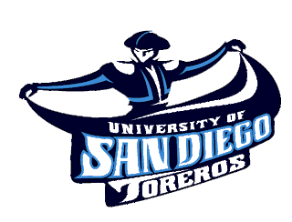
Ok, here's the thing. I really like the name "Toreros" for a mascot. It's not as commonplace as "Matadors" (at least in the sense of every day usage), and it provides a very Latin feel to the University of San Diego, which is obviously located in a city with a strong Latin population. The problem here is the logo itself. I mean, think about how elegant, tough, and showy (in a good way) toreros are. Does this logo do any of that justice? I mean, maybe the 'showy' part, just not in a good way. Let's be honest here: the torero in this logo looks like he's holding up his skirt to do a curtsy after a ballroom dance. I'm not ok with that. Not that there's anything wrong with curtsies or ballroom dancing; but I don't think that's the image a torero wishes to give off. Just a guess. The color scheme is terrific, the name is cool; but man, that logo is bad. I was hoping for a smooth-looking dude whipping his cape around or something; not a guy looking like he's holding up his skirt. We'll give you a mulligan, USD. You nearly nailed all of the good parts of a logo...except for the actual logo itself. Keep the color scheme, the name, and the spirit of the image; just change the logistics a little bit and then we'll talk. Thanks.
~~ Lank
No comments:
Post a Comment