As my boy 'Moo and I were sitting through our training class, he turned me on to a website called LogoShak that has a remarkably extensive collection of logos from sports teams and events. Since I needed something new for the blog (and because November has 30 days), I decided to list the 30 worst sports logos of all time. I designated 'Moo as creative director of the project since he a.) found the site before I did, b.) has a good eye for a bad logo, and c.) agreed to go through half of the logos on the site so that I didn't have to spend even more time than I already do with unproductive exercises. I will be listing one per day for the next 30 days. There was no strict criteria; it just had to look ugly. Sometimes the logos were too busy, some of them had terrible color schemes, and some were just way too plain. Regardless, we tried to put together list of the all-time worst for your enjoyment (or displeasure, whichever). Let's keep this train rolling...
#17 - Detroit Pros
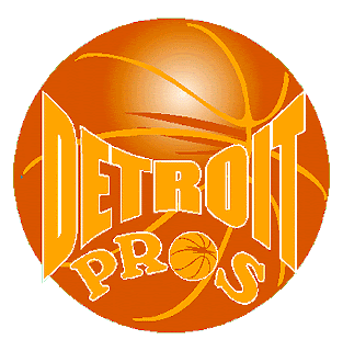
This is a pretty bad logo. What's worse, though, is that I had to do some research to figure out in which league the Detroit Pros actually play. The answer? The International Basketball League (IBL), which is a minor league below even the CBA. I don't know any other teams in the IBL, I just know that as I was perusing LogoShak, I stumbled across this terrible logo. Look at the colors. I mean, what is that? Gold and orange? Were they trying to save on jersey costs by only wearing one color or something? They have a huge basketball as their backdrop and then a smaller ball with the same design as the 'o' in 'Pros'. None of this makes sense to me. I realize it's a minor league, but that doesn't mean you have to have a minor league logo. No good, Detroit; no good.
~~ Lank
No comments:
Post a Comment