As my boy 'Moo and I were sitting through our training class, he turned me on to a website called LogoShak that has a remarkably extensive collection of logos from sports teams and events. Since I needed something new for the blog (and because November has 30 days), I decided to list the 30 worst sports logos of all time. I designated 'Moo as creative director of the project since he a.) found the site before I did, b.) has a good eye for a bad logo, and c.) agreed to go through half of the logos on the site so that I didn't have to spend even more time than I already do with unproductive exercises. I will be listing one per day for the next 30 days. There was no strict criteria; it just had to look ugly. Sometimes the logos were too busy, some of them had terrible color schemes, and some were just way too plain. Regardless, we tried to put together list of the all-time worst for your enjoyment (or displeasure, whichever). Let's keep this train rolling...
#20 - Mobile Mysticks

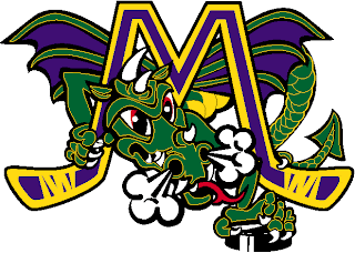
Wow, where to begin. Hmm. Ok, let's start with the spelling of the name. I'm sure that out of the 8 people that read this post, 7 of you thought I misspelled "Mystics" when actually the name is spelled "Mysticks". As in hockey stick. Get it? The Mysticks belong to the East Coast Hockey League, a minor league that has an affiliation with various NHL teams. They went under in 2002 and became the Gwinnett Gladiators in 2003. Just a little background info for you. Back to the logo. It's awful. The dragon looks like he's straight out of a children's book, the smoke coming out of his nostrils is laughable, and the fact that he's nestled beneath two hockey sticks makes him look imprisoned. I mean, really, what is going on in this logo? Who designed it and thought there was no way it was too busy? There's smoke, wings, a puck, two hockey sticks, a freakin' dragon, and a big 'M'. That's quite a bit of stuff to have prominently featured in a single logo. Apparently the franchise grew some brains on the road to Gwinnett, because the Gladiators have a fantastic logo that wouldn't be on this countdown even if I stretched it out to 100. Which I won't, because I'm already tired of looking at bad logos. Eleven down, nineteen to go...
~~ Lank
No comments:
Post a Comment