As my boy 'Moo and I were sitting through our training class, he turned me on to a website called LogoShak that has a remarkably extensive collection of logos from sports teams and events. Since I needed something new for the blog (and because November has 30 days), I decided to list the 30 worst sports logos of all time. I designated 'Moo as creative director of the project since he a.) found the site before I did, b.) has a good eye for a bad logo, and c.) agreed to go through half of the logos on the site so that I didn't have to spend even more time than I already do with unproductive exercises. I will be listing one per day for the next 30 days. There was no strict criteria; it just had to look ugly. Sometimes the logos were too busy, some of them had terrible color schemes, and some were just way too plain. Regardless, we tried to put together list of the all-time worst for your enjoyment (or displeasure, whichever). Let's keep this train rolling...
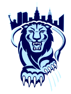
#16 - Columbia Lions

I just got finished watching the Colts take down the Patriots in thrilling fashion (more on that in a minute), so I don't really have much to say about this logo. I just think there's entirely too much going on in it. Yes, Columbia, we realize that you're in New York City and you take pride in that; but how much is too much? How many NYC landmarks can you squeeze in to one logo? And what's up with that lion's tail swinging all the way around his body? This is just kinda silly looking, to be honest. Not a fan at all. That's all I have. I'm still giddy.
~~ Lank
No comments:
Post a Comment